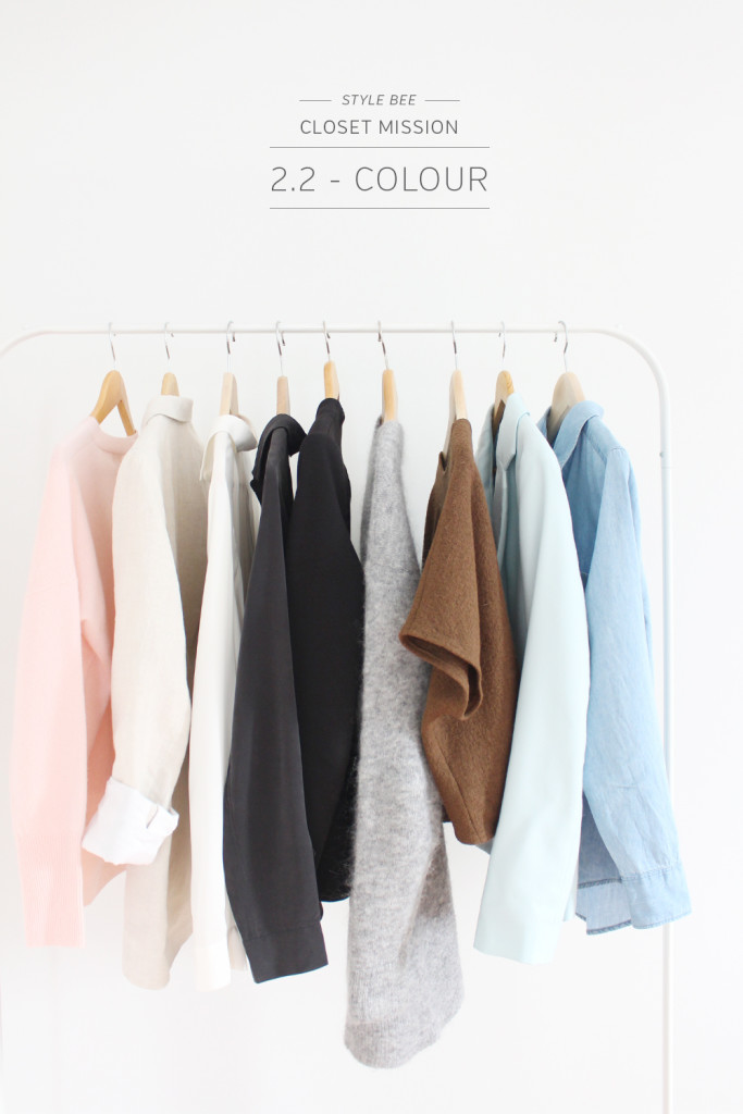
COLOUR
Welcome to the next topic in the closet mission series, colour! Colour has such a visceral affect on us all. It can evoke an emotion, change a mood, give us energy or even calm us down, all just from looking at it. Pretty powerful stuff!
During my first year of art school colour theory was one of my favourite courses. Exploring colour scales, wheels, hues, tones and gradients was fascinating. I loved projects where we’d be given three paint colours and have to create as many possible variations of colour as we could without it turning into mud. Basically it was just a slightly more in depth version of kindergarten and I loved it! One of the most memorable takeaways was during a class critique when we went around evaluating each other’s projects. Everyone in the class was talented but one project stood out in particular and it happened to be by a student who was colour blind. She had combined colours in the most unexpected ways and paired tones that wouldn’t normally appeal to most but somehow it all worked beautifully. It was a turning point for me as I realized just how differently the world of colour can appear to different people.
Colour tells a unique story and how we each interpret it is very subjective. It’s not always easy to pinpoint why we’re drawn to certain ones over others but colour plays an integral role in both our day to day life and personal style story.
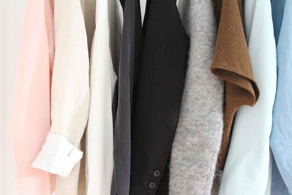
“The best colour in the whole world is one that looks best on you.”
― Coco Chanel
There are all kinds of colour theories out there suggesting what works for someone based on hair colour, complexion, eye colour etc. No doubt you’ve heard that red heads look great in green, blue eyes light up when you wear blue or bright colours are best on medium and darker skin tones. Even though I’m sure there’s a lot of validity in such theories I don’t give them much weight when it comes to what I choose. How you feel about a colour and better yet, how it makes you feel when you wear it are far more important than whether or not it’s right by some standard.
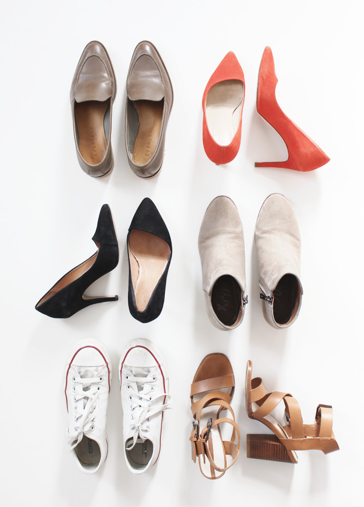
Curating A Palette
Before I started blogging I never gave much thought to colour. I’d just go for colours that I liked at the time or that stood out to me. Then, soon enough I’d suddenly find myself in a style rut feeling like I had nothing to wear and that nothing in my closet matched. I had bright dresses, vivid t-shirts and patterned pants that were fun and maybe even cute on their own but not in the context of my wardrobe. So during my 2014 mission, albeit a vague and hasty one, I started focusing more on truly timeless pieces in neutral colours and before long I felt like I had a lot more options and I could put together simple chic looks instead of wearing loud patterns and bold colours that had never felt quite right on me.
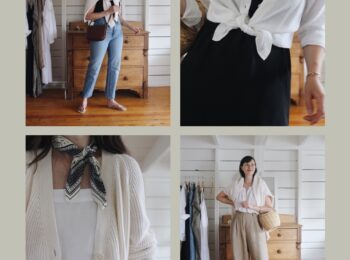
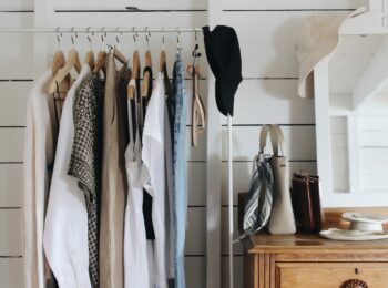
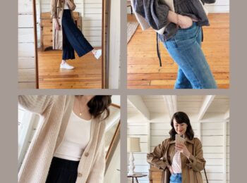
Today, I’m a firm believer in a lean, neutral palette. Don’t get me wrong, I like colour and I really admire people who can wear bold hues every day and make it look easy and fabulous but that’s just not me. The point of this mission is to find closet contentment. This means figuring out what I feel great wearing and what I’ll want to keep coming back to. This next step is all about identifying a core colour palette to maintain in our wardrobes. Understanding this will help give our closets a lot of versatility and the ability to create more great outfits with fewer pieces.
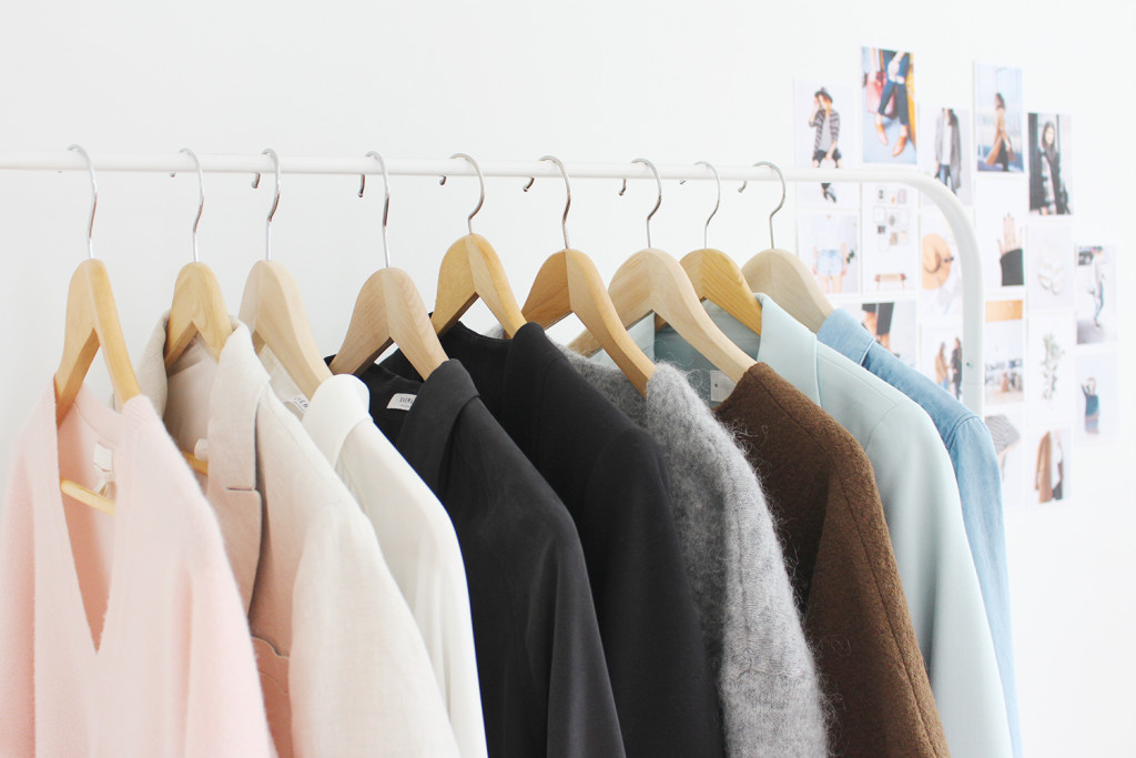
So let’s put together a colour palette shall we?
5 simples steps to create one are as follows:
1. Start by thinking about the last three outfits you wore and loved. List all the colours in them.
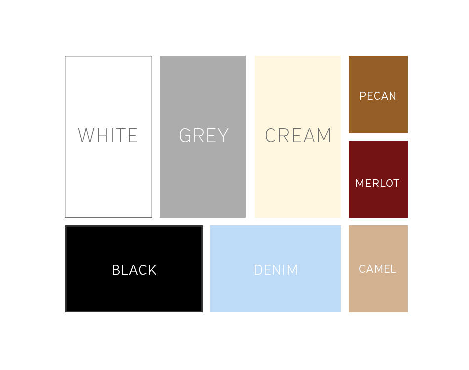
Mine were: Black, White, Cream, Denim, Grey, Camel, Merlot and Pecan.
2. List all the colours you feel great in.
I listed: Black, white, denim, grey, cream, neutrals (but not so much nude), emerald, merlot, rich earthy tones and occasionally pale pastels.
3. What colour(s) do you love but rarely wear?
I listed: Dark Green
4. Look at your images from last week’s exercise. List the 8 most reoccurring colours throughout.
Mine were: White, Black, Grey, Pecan, Camel, Denim, Sage and Merlot (starting to see a trend here?)
5. Fill in the boxes below to create your palette of 8 key colours. Seem limiting? There are actually 40,320 different combinations possible with just those 8 colours! But feel free to create one for Fall/Winter and one for Spring/Summer if you prefer.
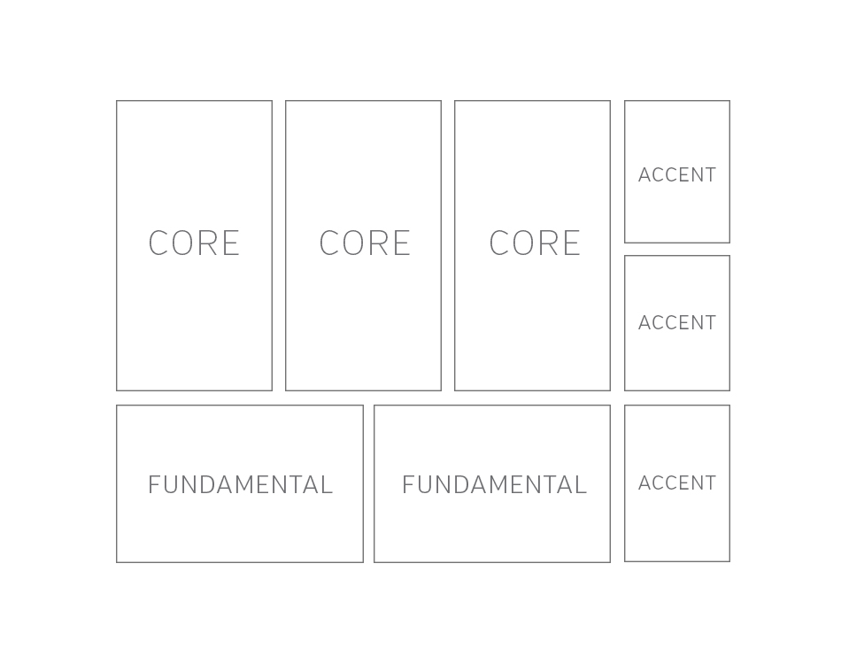
- Fundamental Colours – These are the two colours you can’t live without.
- Core Colours – These are three colours you love to wear and don’t get sick of often.
- Accent Colours – These are a great way to add interest and switch things up. You might pull these into a look via scarves, accessories or shoes.
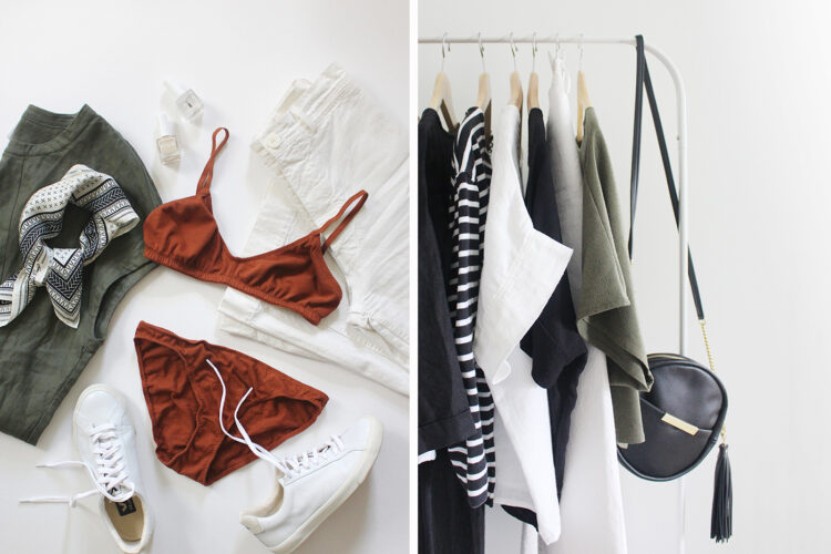
My palette looks like:
WORKBOOK
COLOUR Workbook – PRINTABLE PDF
COLOUR Workbook – EDITABLE PDF
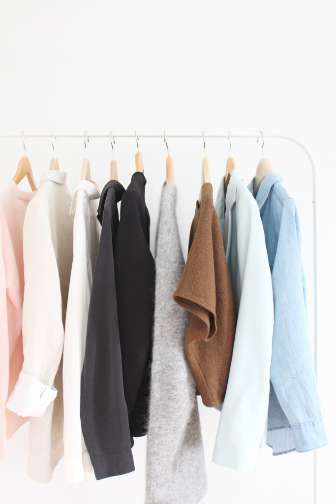
Here are a few other resources to get your colour senses tingling:
1 – Colour Lovers – A bizarre yet amazing social forum for the love of colour. Explore some gorgeous palettes here or build your own here. You can even choose a photo from last week’s exercise and pull colours from it.
2 – Into Mind – How To Choose A Colour Palette is an awesome blog post with tons of tips and colour palette inspiration.
3 – Instagram Feeds – Five of my favourite accounts for colour inspiration are:
- @MONINGLEE – Epic Bright and Bold Combinations
- @INKANDPULP – Pretty Pastels
- @NEEKMASON – Beautiful Neutral Vibes
- @LUCYLAUCHT – Beachy Blues
So what do you think? Ready to commit to a lean colour palette? What are your fundamental and core colours? I’d love to hear your thoughts.
Next up we’re talking prints and pattern!




Hi Lee, I think you have the wrong link of madisonbosworth? Not sure but that account has only two posts as of today???
Thanks for letting me know Ana. This post could use some updating and I think the account I’d originally referenced has since been deactivated.
Thank you so much for this! I have not completed the whole Closet Mission, but I will read through it to see what more I can learn! I completed the palette and it make me feel I’m really taking some steps towards defining my style. I’m intrigued by the 10 x 10 Challenge, so maybe that’ll be my next step 🙂
Hey Anna, That’s great to hear you found the colour workbook helpful. It’s a fun way to get some clarity about your style. Definitely give the 10×10 a try! Even if you just do it offline I’ve found it really useful. xo
My pleasure Anna! So glad you found this step useful! It’s really fun to see how the colours come together and how much you can do with a lean palette. Definitely consider taking the 10×10 Challenge, it’s a lot of fun and a great way to gain some insights quickly. xo
This was such a fun exercise! Thanks for posting! Here’s how I panned out:
Fundamentals: Black and navy/denim
Core: Grey, white, green (mostly army green but there’s some hunter/forest in there too)
Accents: Beige/camel, gold, red
Hi Anna, So glad you enjoyed it! Your palette is gorgeous! I love army green and hunter green. Hoping to add more in my closet this spring. Xo
Your color tastes are exactly the same as mine! Haha. I absolutely love neutrals, but I’m super excited for spring to come around so I can add some pastel purple and green into my wardrobe!
Haha that’s great! Neutrals are just so good, I’ll never get enough! Spring pastels are so inspiring right now. Dying for some warmer weather! Thanks for reading! xox
I’m really enjoying these posts. Very helpful and inspiring. For me, I’d have to say navy and off-white or cream are my fundamental colours. xo
That’s great to hear Rita, so glad you’re enjoying the series. Mmmm navy and cream are such a gorgeous combo. xo
This was great Lee! I absolute love color! My fundamental and core colors were the same as yours. Big surprise, lol. My accent colors would be blue (navy & turquoise), wine/ merlot and fuschia. This was very helpful. Glad we are on this lean closet journey together! Have a great weekend and stay warm if you can❤️
That’s so great to hear Jodie! I’m so glad we are too! I love navy, thinking it could make it’s way into my spring closet a bit more 😉 xoxo