


Happy Friday everyone! Thanks so much for your excitement and feedback on the Style Bee update. I’m so glad you’re liking the new features and branding. It sure feels good to have it all out in the world!
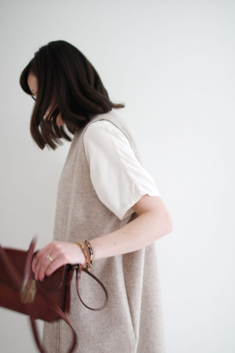
I thought it might be nice to get back into the swing of things with a simple outfit post featuring one of the colour palettes I’ve been wearing a lot these days. It’s one I used to reserve primarily for warmer months but I was inspired to try it for the colder season too. Moral of the story? There really are no seasonal colour palettes when you’re wearing what feels good!
Let’s have a look shall we?

INITIAL THOUGHTS
I used to avoid light tones like oatmeal, cream, taupes and other soft neutrals during the winter, particularly around my face. The reason being that they tend to wash out my already sun-deficient complexion. But, I love these colours right now and I came across some great style inspiration on Pinterest (here, here and here) so I decided to give it a go. Perhaps it’s not doing me any favours but my theory lately is that life is just too short to worry about what looks best, when it should be about what feels best. So light tones it is!
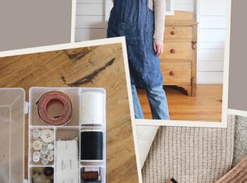
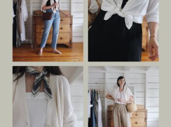
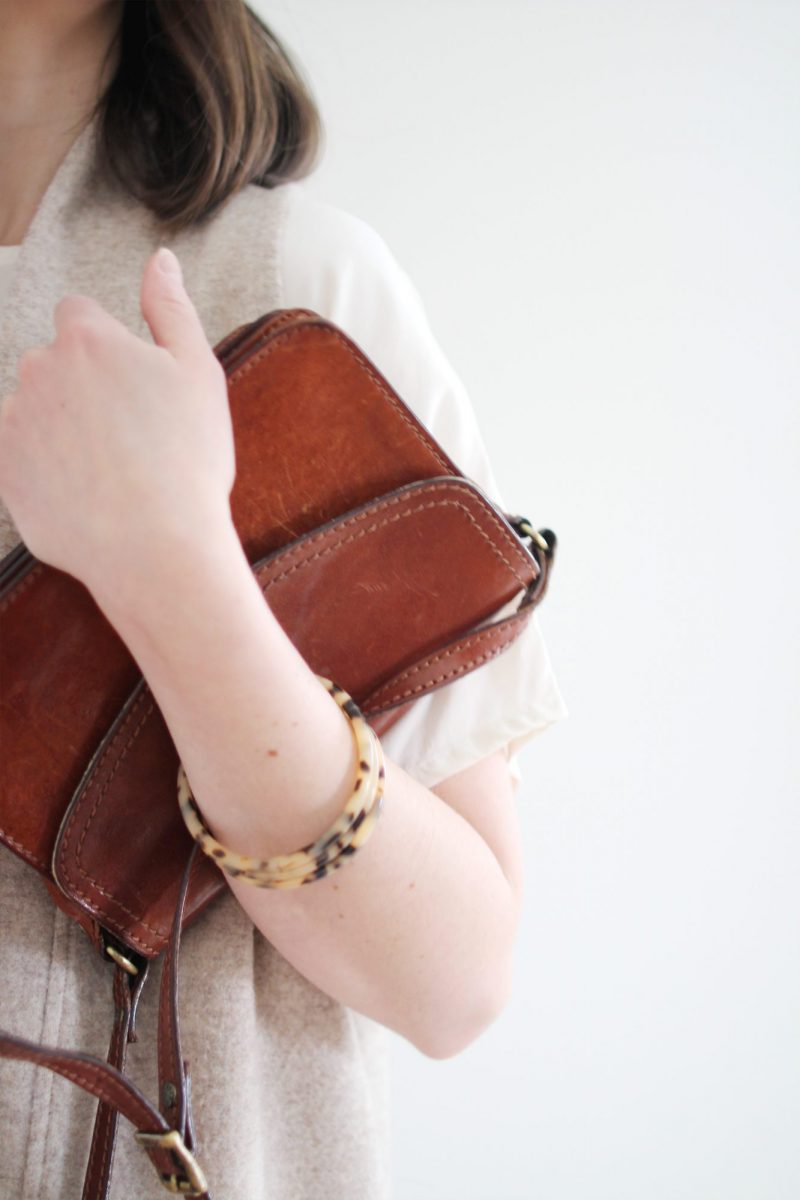
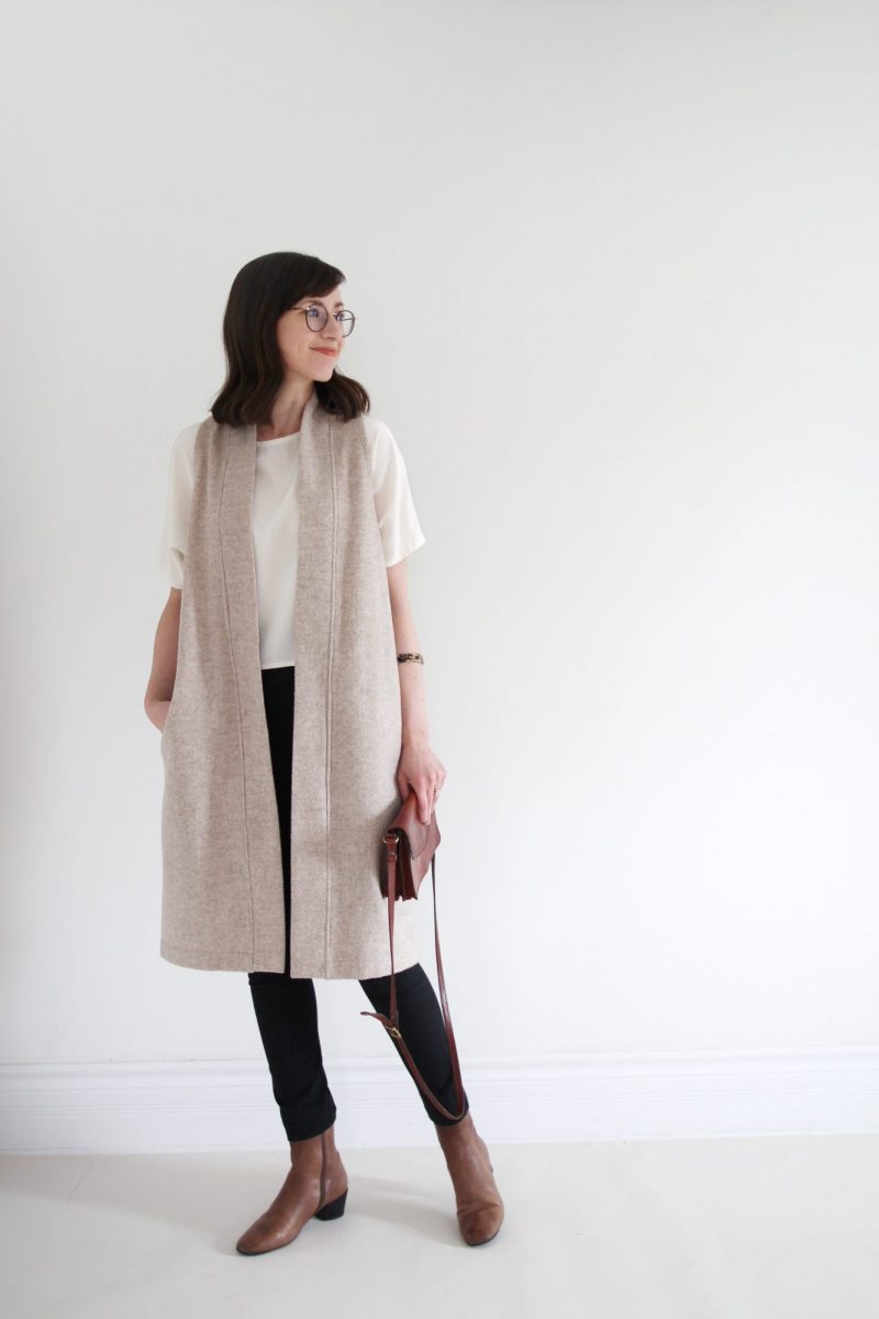
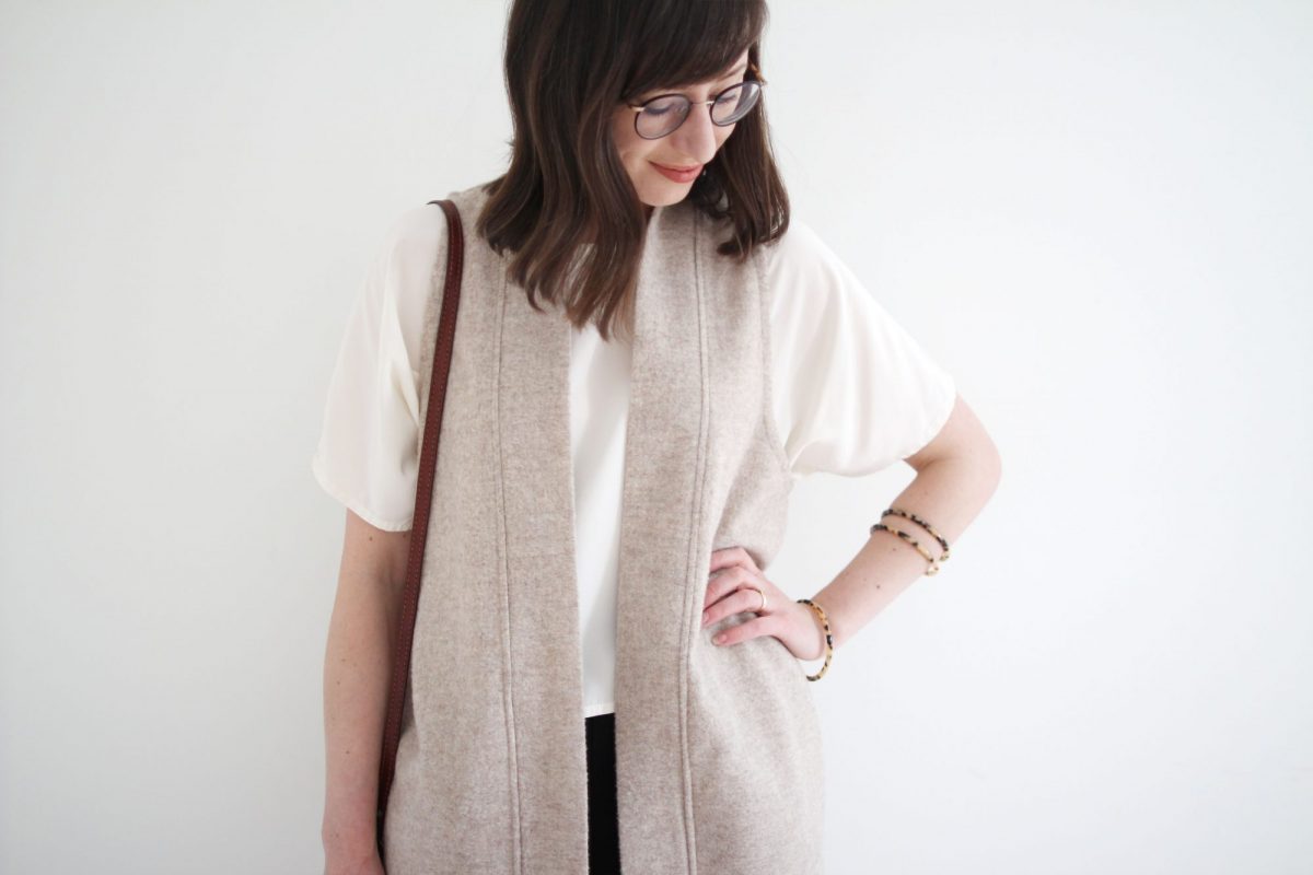
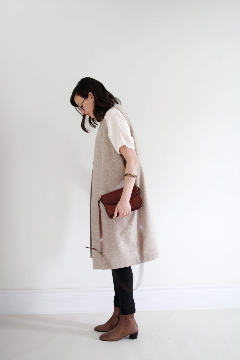
I wore this outfit to a client dinner and it was perfect for the occasion. Elegant and professional with some unique elements like the duster vest and stacked tortoise bangles. I could see it working great in an office setting and would absolutely wear it again to a design meeting.
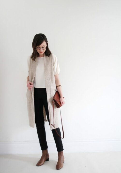
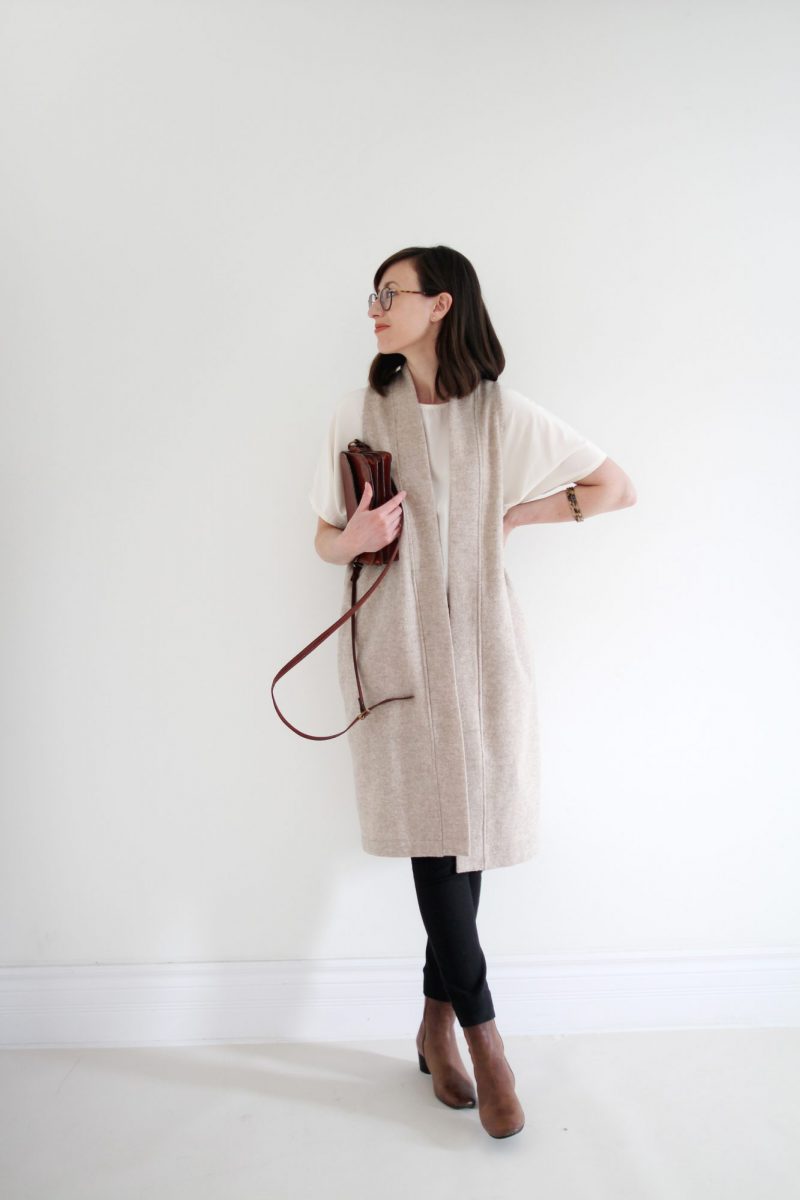
THE PALETTE
BLACK COTTON | TORTOISE ACCENTS | TAUPE LEATHER | IVORY SILK | OATMEAL WOOL | OXBLOOD LEATHER
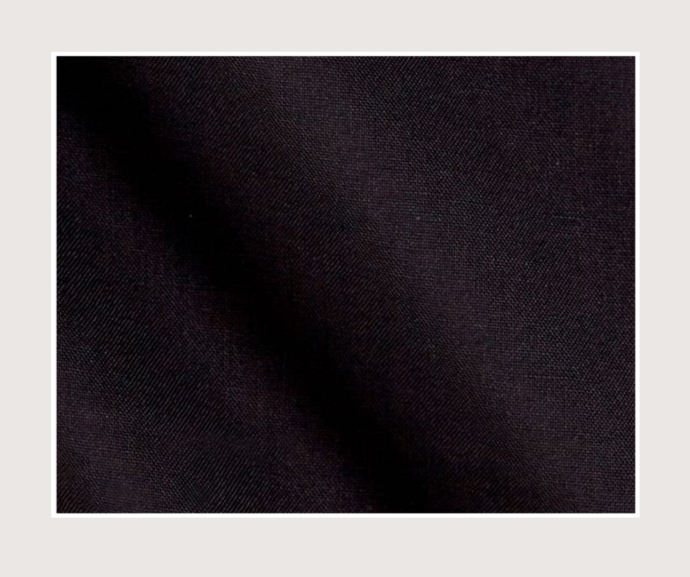
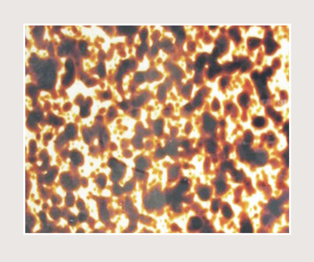
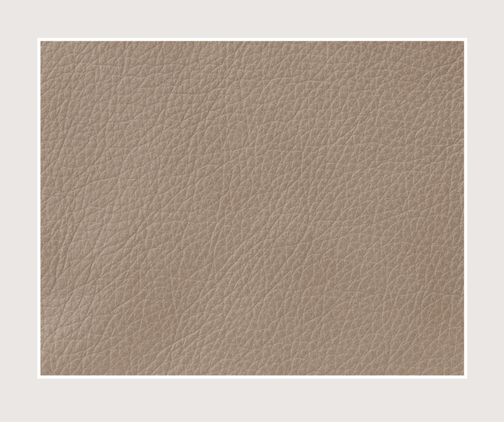
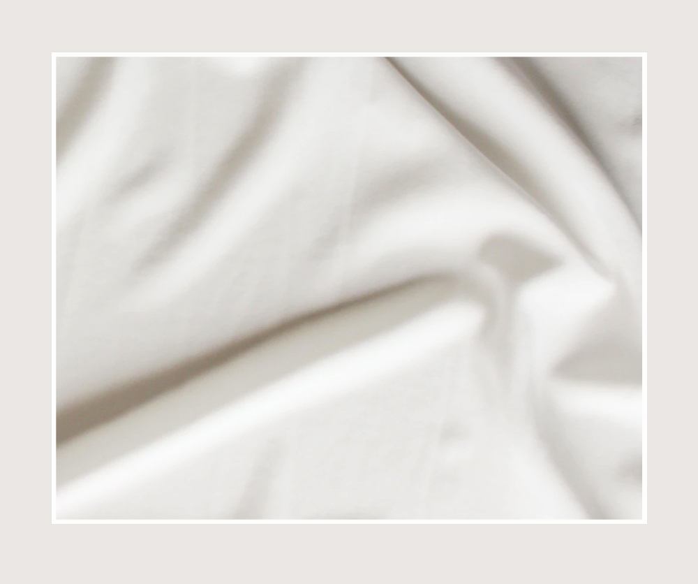
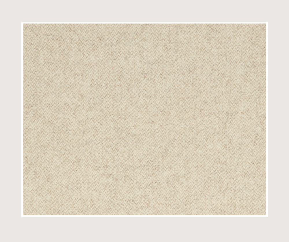
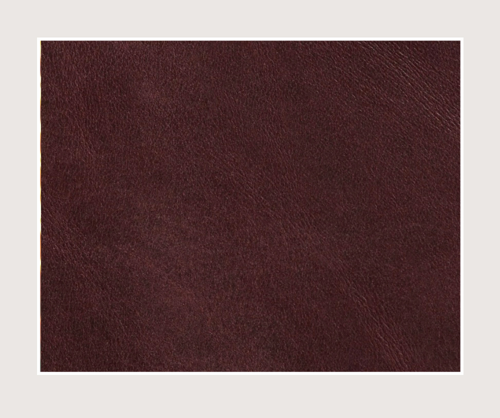
Before we get into styling notes I thought it would be fun to pull the key colours and textures from the look and create an actual palette to show how they work in a more abstract way. When I look at these swatches like this I can imagine a whole bunch of different ways to mix and match them.
Does this palette spark any ideas for you?
STYLING NOTES
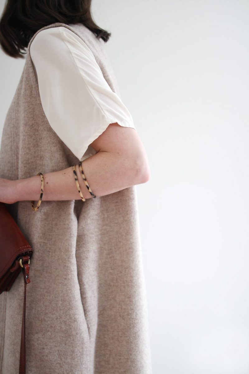
TOUCH OF TORTOISE – I’ve been loving the tortoise shell trend that’s been going strong for a few seasons now. I usually wear my Kate Hoops but when I’m wearing glasses I like to keep my earrings low-key so I opted for tortoise bangles instead. The tortoise pattern on my glasses and bangles is super subtle but just enough to add a hint of repetition.
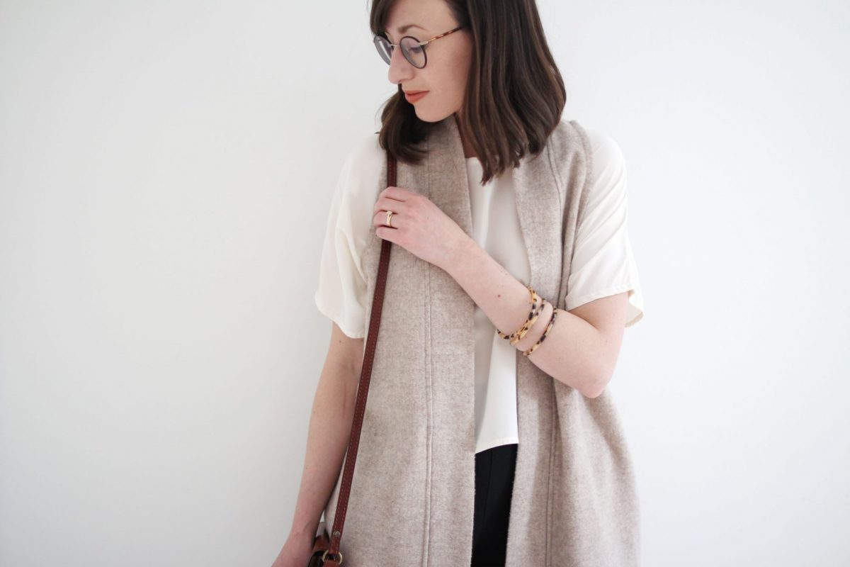
TONAL ELEMENTS – Who knew oatmeal and taupe were such colour pals? After I finally got my Cally boots back from the shoe repair shop (I had them deep cleaned and the sole on the toe replaced) I couldn’t wait to wear them again and love how they work with my oatmeal wool duster vest. The two colours are in the same tonal range and have a similar warm undertones, which makes them highly compatible. Additionally, the creamy silk Linn tee is also within this warm neutral range so the three pieces play up this colour story nicely.
The final touch was to grab my vintage bag in a rich oxblood leather that basically hasn’t met a look it couldn’t improve in all the years I’ve had it. I’ve linked to a similar vintage option in the shop section below.
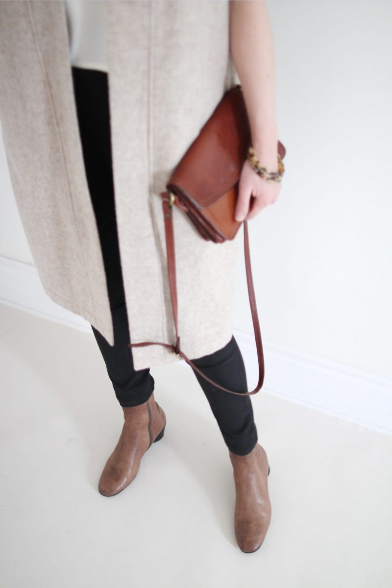
DOUBLE DUTY – I was tempted to wear a light pant with this look but ended up reaching for my Cecilia’s because I wanted to: a) ground the lighter colours with something dark and b) contrast the loose top layers with something fitted. They ended up doing the job for both! When in doubt go for the slim black pant, it’ll never let you down. Promise!
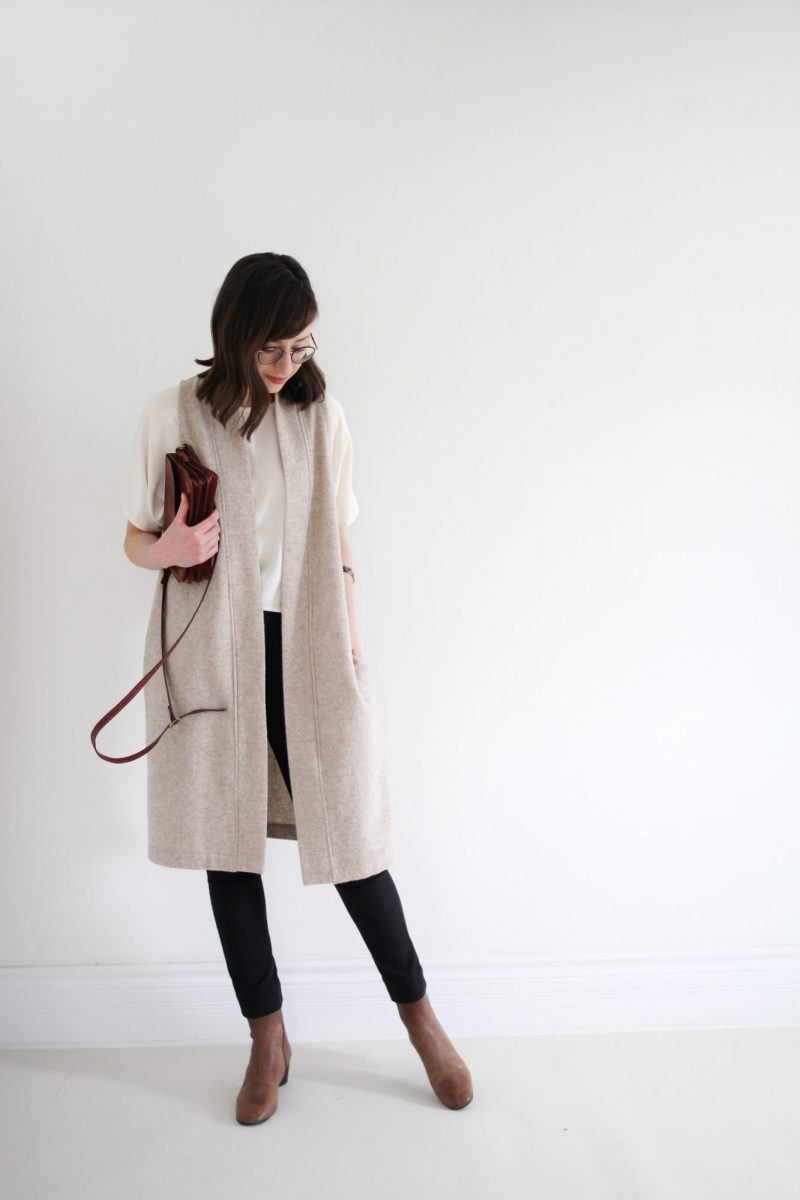
MIXED MATERIALS – One of my favourite styling tricks when it comes to a simple colour palette like this one, is to add interest through mixed materials. Silk, wool, cotton, smooth leather and a touch of glossy acetate (my bangles) all combine for a soft but layered texture compilation.
There you have it! The winter palette I’ve been loving lately and a few style tricks to try out.
What colours and textures have you been wearing these days?
SHOP THE POST
You can shop all these items through the new Shop My Closet Page or via the links below. *Please note: some are affiliate links and items that are no longer available are linked to a similar option.
- BOLINAS DUSTER | gifted | ONLY CHILD | Made in Oakland, CA | On Sale
- LINN TEE | ELIZABETH SUZANN | Made in Nashville, TN | I wear OSM
- CECILIA PANT | ELIZABETH SUZANN | Made in Nasville, TN | I wear a 2 Regular | Sold out | Similar option available here for less.
- CALLY BOOT | gifted | COCLICO | Made in Spain | On sale currently | Similar option available here for less.
- EARRINGS | BRACELETS | FRAMES | BAG*
WISHING YOU A WONDERFUL WEEKEND!
This post is not sponsored but contains affiliate links. When you shop via the links above I may make commission on a sale. Thanks for supporting Style Bee! All opinions are always my own.


This is an outfit I have already (meaning these colours and the duster) inspired from earlier posts of yours. But the tortoise accent takes it to a new level. Love love love!
I have a very light grey Soia & Kyo coatigan that I rarely wear as I’m never quite sure how to style it This post has inspired me to pull it out again; clearly a shorter layer with a longer top is the way to go. Thanks!
That’s great Kathleen! Sometimes it’s tricky to see potential in some items. Glad you’ve got a solution!
Really enjoying the new website!!
So easy to navigate, I’m really enjoying wearing lighter shades this winter also
Sooo glad your back!
That’s so great to hear Linda! Thanks so much for the kind words. Glad to be back too 🙂 xo
Beautiful outfit! I would love to see more of your light, textured winter outfits on the blog. (Here in Zurich it’s gloriously sunny but still cold; perfect for soft, light-coloured layers.)
Thanks for this feedback Anna. Zurich winters sound so lovely! Enjoy. xo
I love this look! It’s totally office appropriate but so unique! *goes off to look for tortoise bangles*
Thanks Sarah! So glad you agree that it’s office appropo 🙂 Haha I am in full support of your angle search! Have a good weekend. xo
Hi Lee!
First, your new website is lovely! In fact, this is the first time I’ve been compelled to comment, I love it so much! Second, I LOVE this palette and how the tiles also reflect the texture. When I glanced at it I immediately started to visualize different looks. Like, I love that your look is thoughtful and understated, but this palette could also be used to create a super glam 80s/90s look! That’s why I think working within color palettes is so powerful – they’re extremely versatile!
That’s awesome Elizabeth, thank you so much! I’m glad the palette tiles inspired some different ideas for you too. They really are so fun to play with! I can totally see those colours/textures working for a much bolder look. Love me some 90’s glam! Xo
Lee, you’ve just changed what I’m wearing today. I love taupe and oatmeal. They are my version of brown and beige, because I don’t like anything with yellow or orange in it. I’m going to wear either a taupe sweater jacket or an oatmeal cardigan over a white top with black jeans. This was so helpful, because I forgot to iron what I had planned to wear. 🙂
Oh that’s great Carol! I’m not big on orange or yellow tones for myself either. Your look sounds so chic! Have a great Friday. Xo
Hi Lee!
I’m loving the website redesign!
Unfortunately, the formatting seems to be off today and the first half of the text is covered by your lovely pics.
Looking forward to more from you! x
Hi Michelle! Thanks for letting me know about the formatting. I just checked it on a couple of devices and browsers and it’s looking ok for me. Sometimes clearing the browsers cache helps but if not please let me know what device/browser you’re using and I can see what might be causing trouble. Sorry about that!