


The much anticipated primary bathroom update is finally ready for its reveal! BUT before I show the finished space I wanted to share some of the inspiration, planning and materials that went into it. I know, I know, I’ve already made you wait too long but I promise, it’ll be worth it!
I’m going to dive right into today’s quick post which covers the:
- Inspiration board
- Materials palette
- Full mood board & sources
Read on to see how we brought what we’re calling the retro revival bathroom to life!
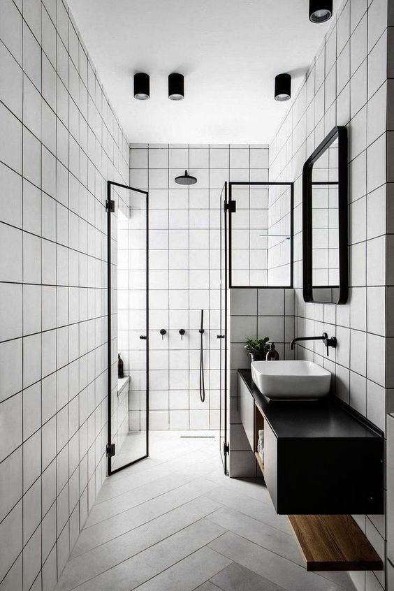
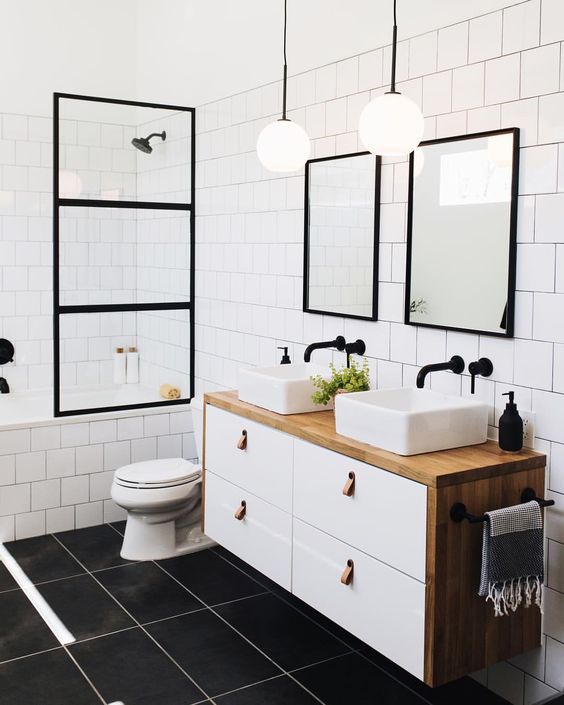
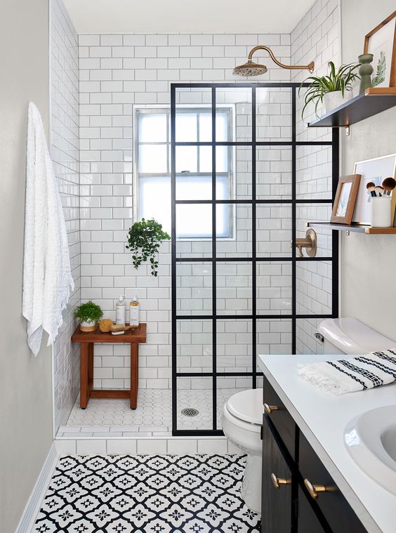
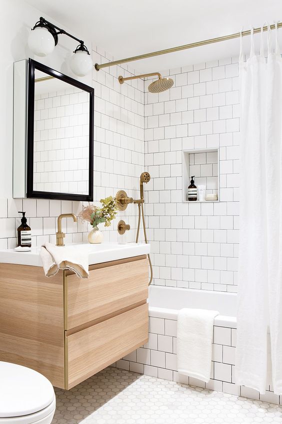
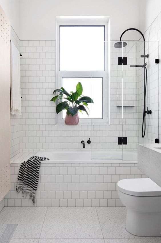
INSPIRATION
Our home is a small red brick two-storey built in the 1890’s and throughout our 7-year long renovation process, we’ve worked to ensure our updates feel fresh but also honour the character of the house.
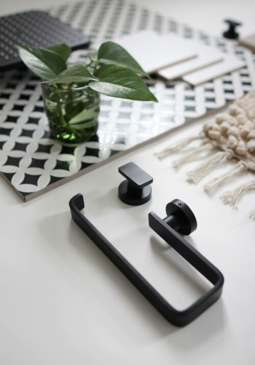
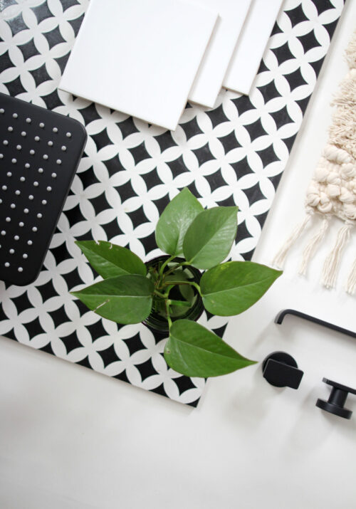
We knew we wanted to use black hardware and fixtures and had already bought a bold black and white patterned porcelain floor tile, so those were some “must-have” elements.
I’ve always loved the look of a square format tile in a grid pattern and I think it suits old homes like ours really well. It’s also easy on the budget and with a dark grout it can make a major impact, so that’s what we decided to do.
We wanted to go with a high-contrast, neutral palette of black and white with wood textures and some colour through artwork and plants. The guiding words I kept in mind when planning were:
INVIGORATING | STREAMLINED | STRIKING
Here’s a look at some of the spaces that inspired our design choices.
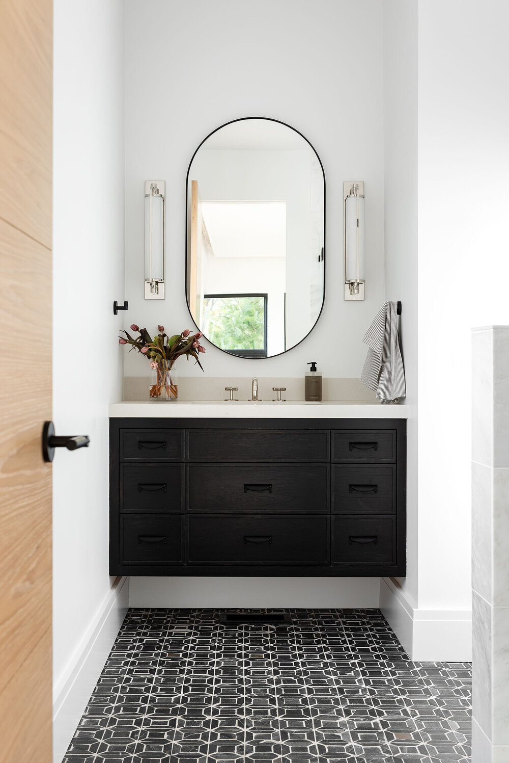
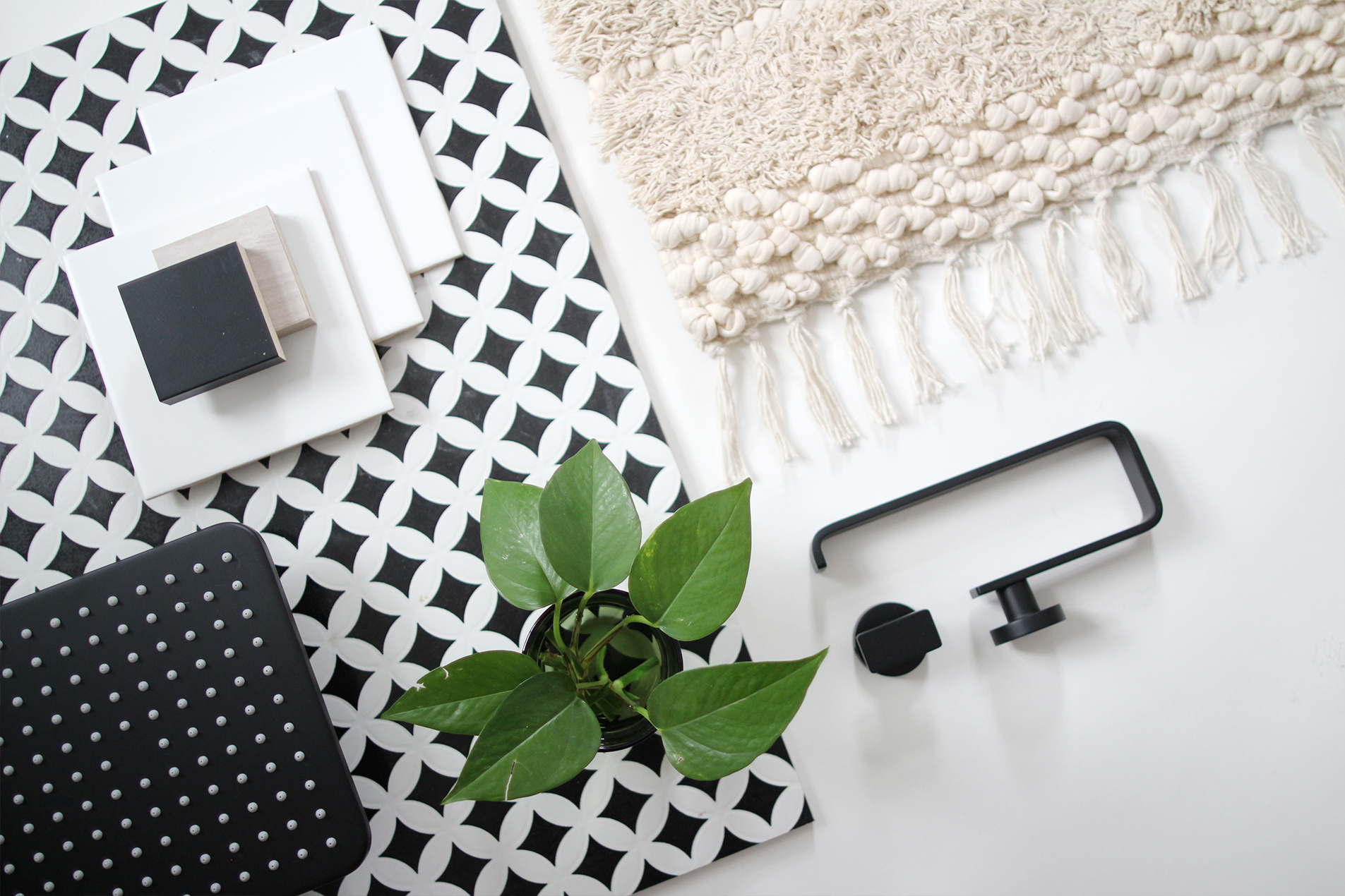
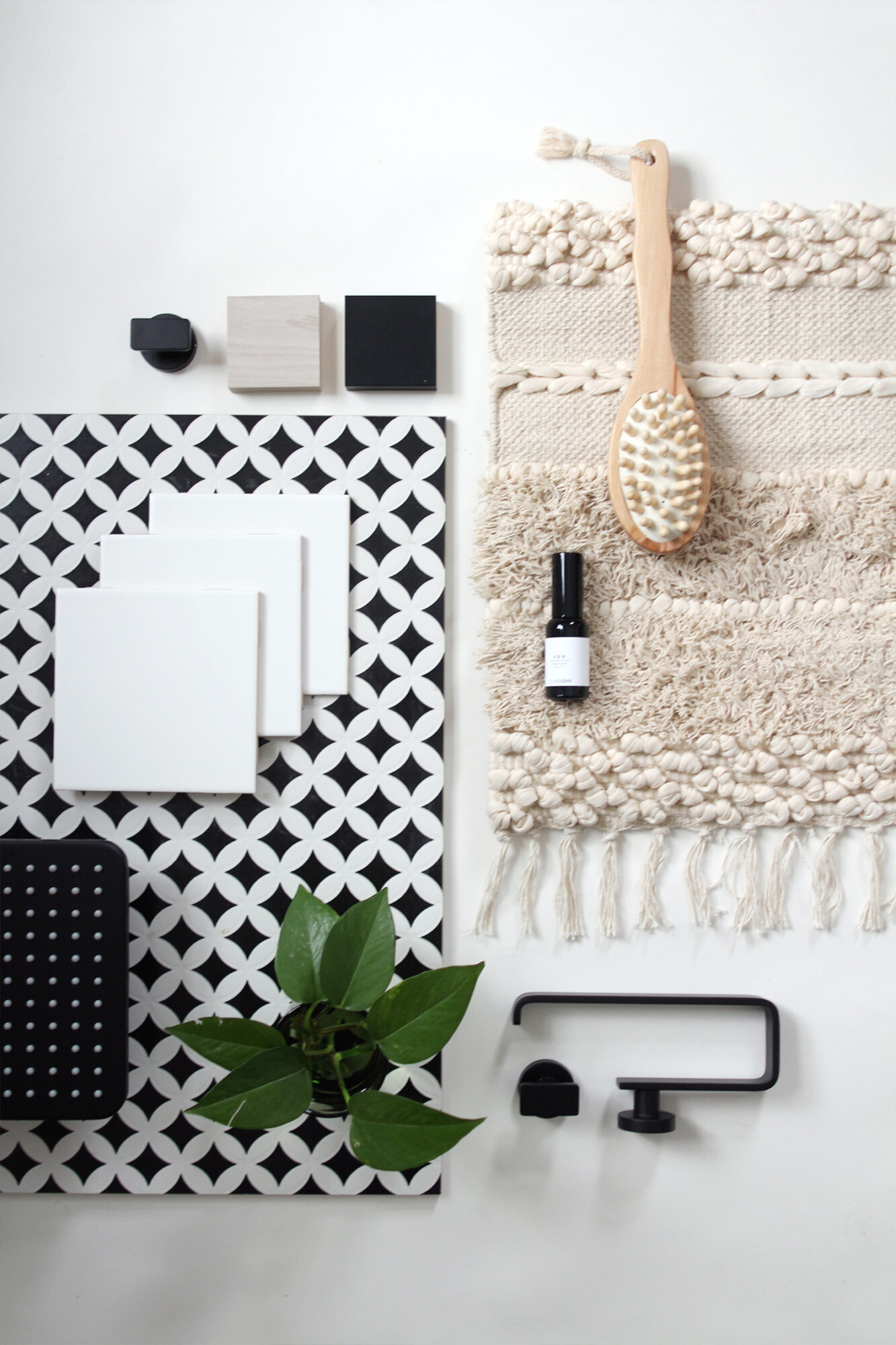
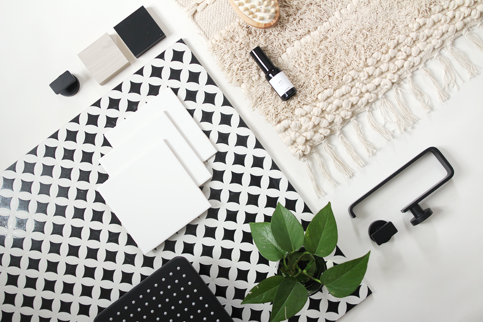
MATERIALS PALETTE
As this is the primary bathroom in the house, we wanted it to have as much of an open feel as possible, while incorporating a tub, shower, vanity, toilet and some storage. So it required some strategic planning and thoughtful material choices to keep it feeling bright and spacious.
One way to approach single room interior design projects is by starting with one element. In this case it was the floor tile, which has a bold, high contrast, graphic pattern. We managed to get the last of the batch of these available and I was so thrilled because they’re the same pattern as what we used in our kitchen, but in black and white instead of grey and white. From there the rest of the materials began to take shape.

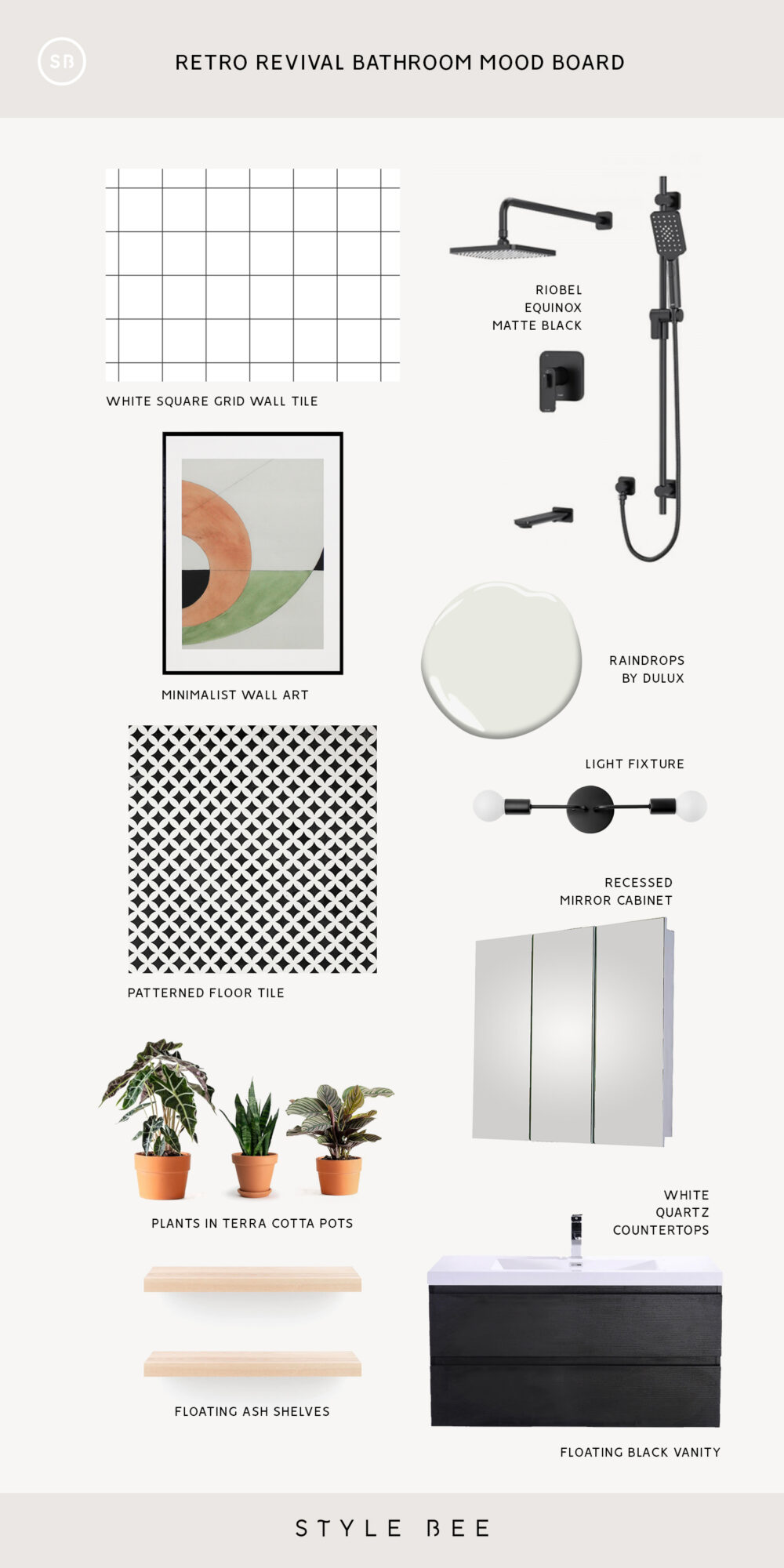
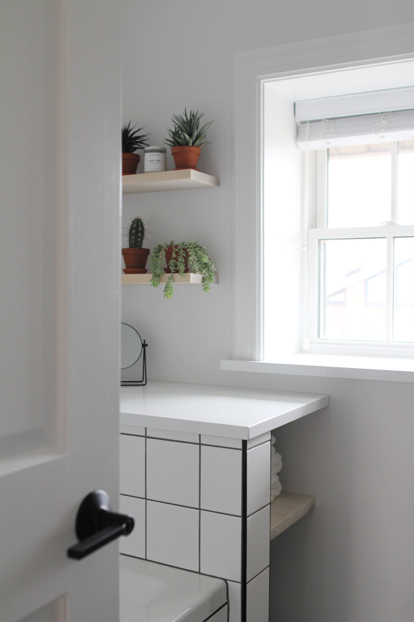
We went with matte black high-quality fixtures from Riobel for the shower, faucet and other accoutrements like towel hangers and toilet roll holder. The feel and quality is so much better than what we’d had and I’m confident it’s going to last. We opted for a black wood floating vanity and a black metal light fixture for above a recessed vanity.
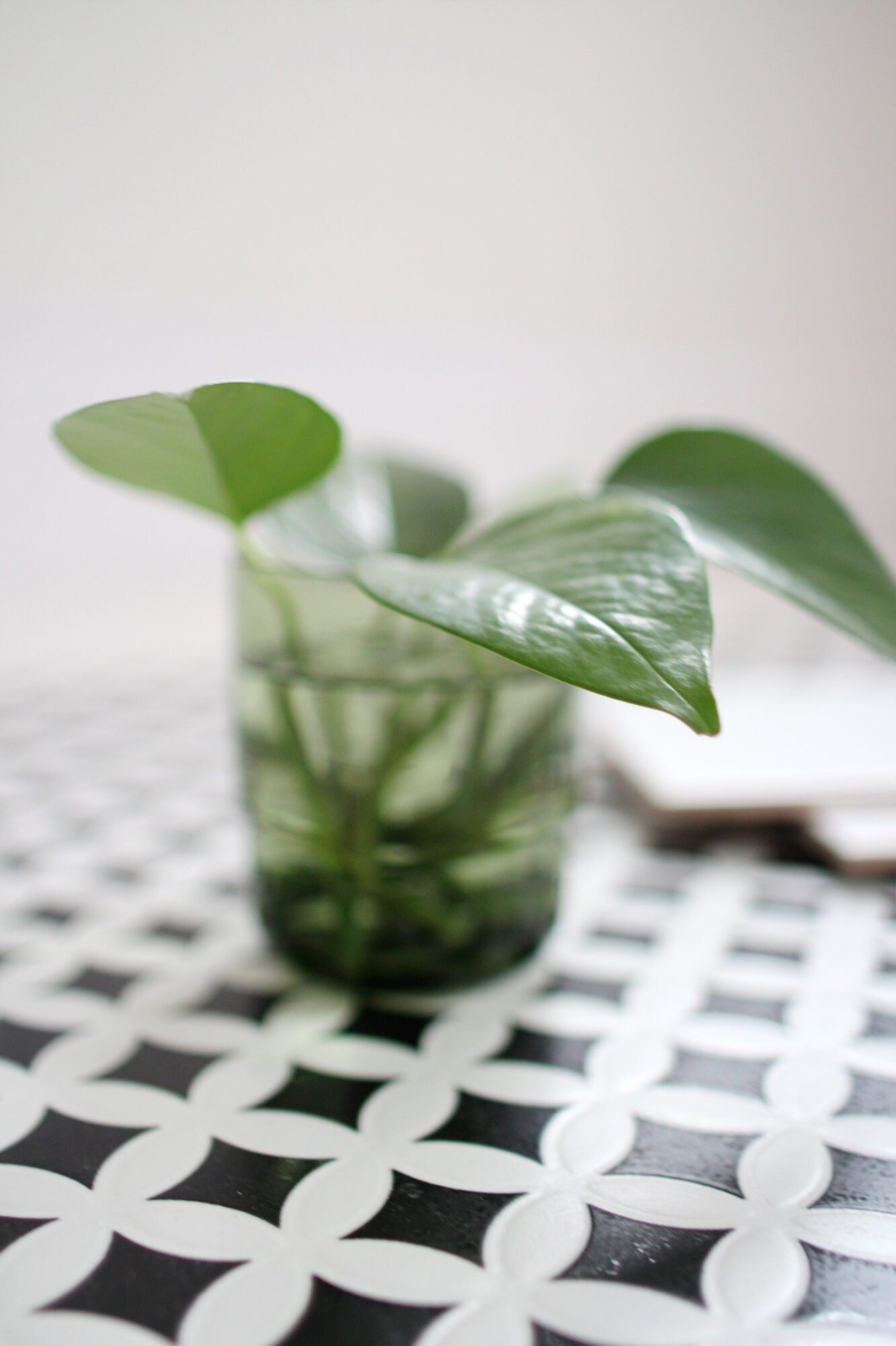
Sounds like a lot of black and it is, however, balanced with white quartz counter tops (we have three counter zones in the space), white tiles and white paint, we felt it wasn’t too much. We also planned to bring in some light wood tones with floating shelves and some green and warm terra cotta through artwork and plants.
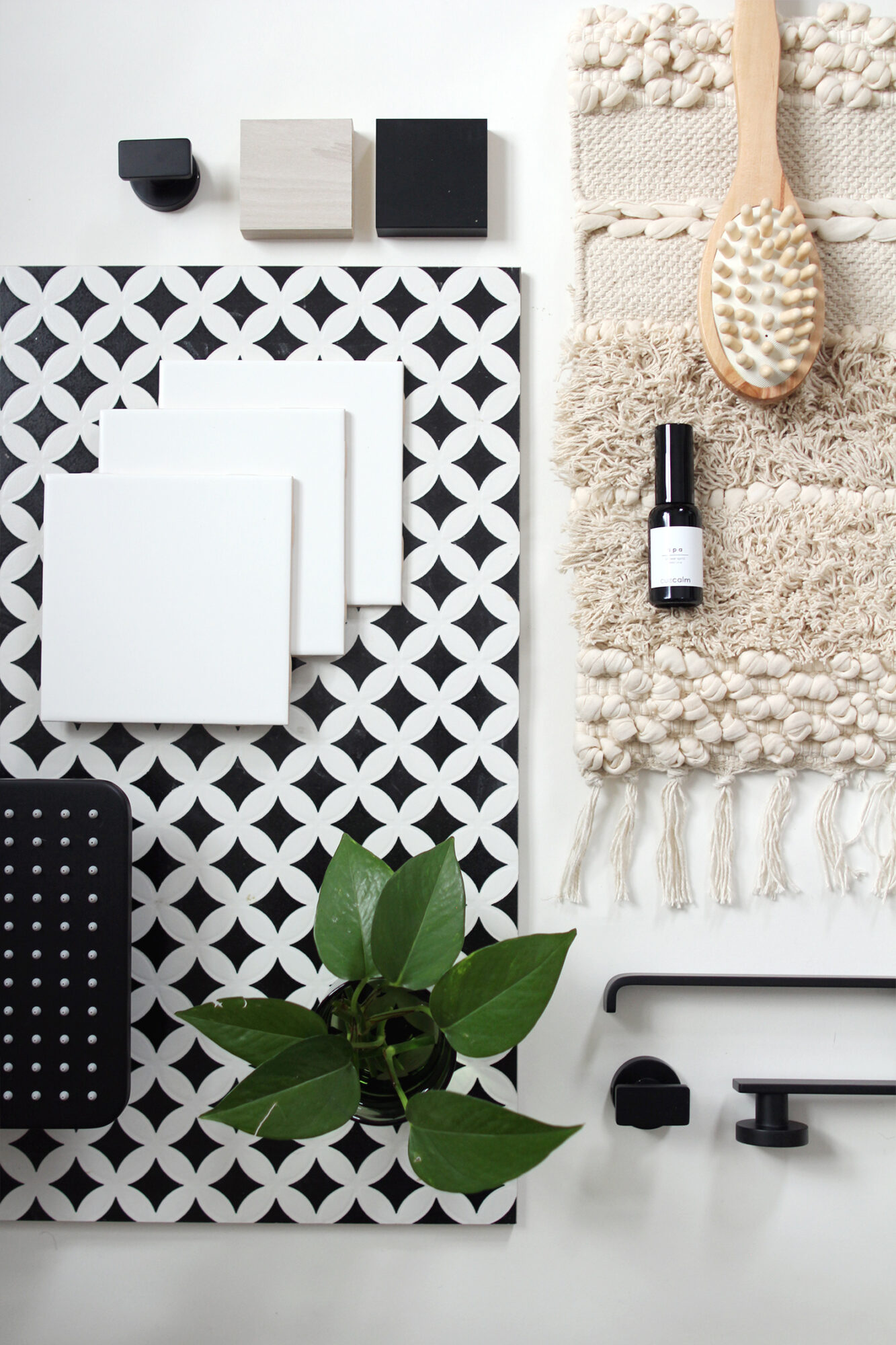
See how all the elements came together in the mood board below.
RETRO REVIVAL MOOD BOARD
SOURCES
WALL TILE (SHOWER): MATTE WHITE 6×6 SQUARE
SHOWER FIXTURES: RIOBEL EQUINOX – KIT#1345EQ MATTE BLACK
TAP FAUCET: RIOBEL EQUINOX – EQS01
WALL ART: AURE via POSTER CLUB
PAINT: RAINDROPS BY DULUX
FLOOR TILE: DISCONTINUED PATTERN BY CIOT
LIGHT FIXTURE: MOBILE SCONCE via WEST ELM (Similar option shown)
RECESSED MEDICINE CABINET: KHOLER VERDERA 3 DOOR
SINK VANITY: NATHANIEL 41.8″ via ALL MODERN
BATH MAT: KNOT & WEAVE MAT via RUG & WEAVE (Use LEE15 for 15% OFF)
TERRA COTTA PLANTERS: DOVER PLANTER via EQ3

THANKS FOR CHECKING OUT THE PLANNING PHASE, BE SURE TO COME BACK FOR THE FINISHED BATHROOM REVEAL ON SUNDAY!
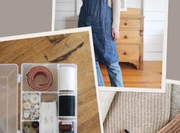
Here’s a super sneaky peek!


We added a bathroom to our home this past year and we’re in the decorating phase (construction is done). It’s so fun to see what you designed! A few of our vibes are similar (natural wood with neutrals) and it’s making me feel like maybe I picked out some cool stuff after all. Can’t wait for Sunday’s post!
That’s so exciting Lindsey! Good luck with the final stages. I’m sure it’ll turn out beautifully! xo